


 Title Index
 Recently Changed
 Page Hierarchy
 Incomplete
 Tags
Tags


For the purpose of this article, we are going to assume you have finished the HTML and CSS for Skin X and you now want to integrate it into the CMS.
Once you have created your html and CSS you must now update your skin to allow the CMS to work with it. The first task is adding placeholders that will hold dynamic content.
To add a placeholder, it is simple. Just add the following attributes with the following values to the tag definition
- cmsPlaceholder="<PLACEHOLDER NAME>"
- cmsPlaceholderType="site" (possible values site, page or reserved)
The placeholder name is the name under which the content will be stored in the database. It is very important to be consistent with the naming of the placeholders. This is so we can switch clients between skins with minimal to no data loss.
IMPORTANT NOTE: Do NOT duplicate placeholder names. Each placeholder name in on a page must be unique for that page. So you cannot add a placeholder general-placeholder2 twice on the inside-page.html, but you could have a general-placeholder2 on both the inside-page.html and the index.html pages.
Reserved Placeholders
This section goes over the Primary and Secondary navigation placeholders as well as the Tribute placeholders, also known as Reserved placeholders.
Navigation
In the template you downloaded, you should already have the placeholder for the primary navigation and one for the main content, so you should be fine with those. On the inside page you will probably want to add the secondary navigation placeholder.
<div id="sub-menu" cmsPlaceholder="secondaryNavigation" cmsPlaceholderType="reserved"></div>
This will instruct the CMS to construct the secondary navigation inside of that div.
Dropdown Navigation
There is a third type of navigation that will output both the primary and secondary navigation in un-ordered lists. This reserved placeholder can be used to output navigation with dropdown menus as seen in our Responsive-1 skin. To use this navigation type use the following placeholder
<div cmsPlaceholder="dropdownNavigation" cmsPlaceholderType="reserved"></div>
This will instruct the CMS to output both the primary and secondary navigation inside that div.
Tribute List
On the home page design you will probably have a tribute list. If the tribute list on the design looks like this
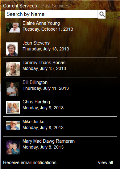
add the following markup.
<div class="arrangement-vertical" cmsPlaceholder="tribute" cmsPlaceholderType="reserved"></div>
If the tribute looks like this
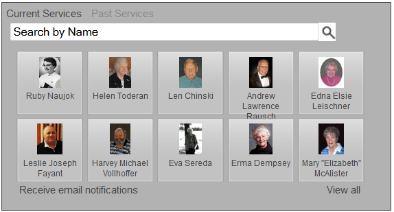
add the following markup instead.
<div class="arrangement-thumbs" cmsPlaceholder="tribute" cmsPlaceholderType="reserved"></div>
Non-call to action placeholders
Call to action place holders will have their own standard naming pattern that we will go over in the next section. This section covers all other placeholders on the skin and the names they should have.
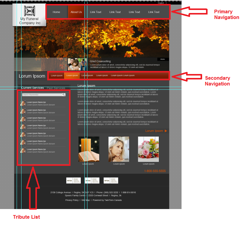
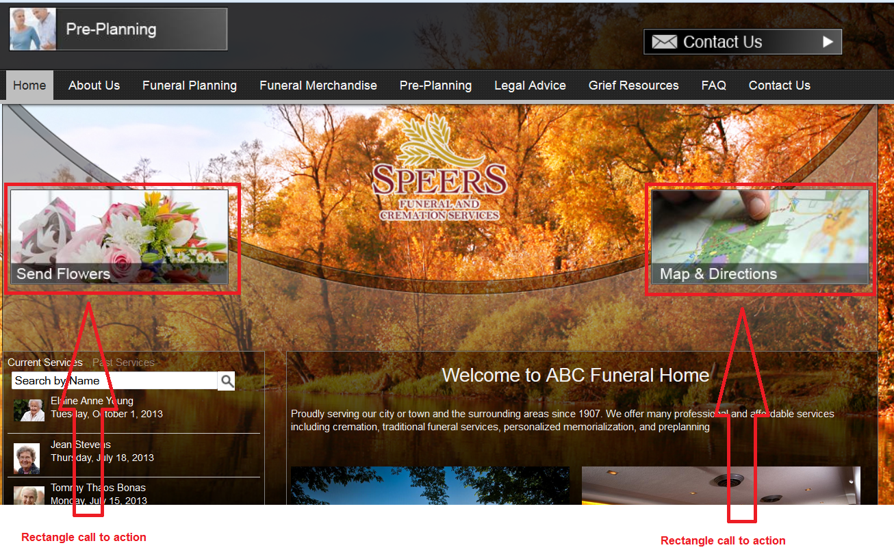
The image below shows an example skin and it points out common placeholders and the names they would have.
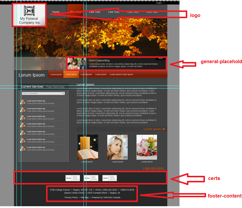
The logo and footer-content placeholders must be present. When switching between skins these will contain the log and the address information (as well as any other footer info) for the site. The general-placeholder name is for placeholders that are not call to actions, reserved placeholders or the logo and footer placeholders. These contain data that could go in any spot on the site. When adding general placeholders, you cannot have duplicates, so you will have to start adding numbers after the first one. For example, if you had 3 general placeholders on the page, they would be named in the following way.
- general-placeholder
- general-placeholder2
- general-placeholder3
Call to Action Placeholders
There will be two types of call to action placeholders, ones that are square, and ones that are more rectangular. See call to action sizes wiki page for the general size information. Square call to actions have the placeholder name call-to-action.
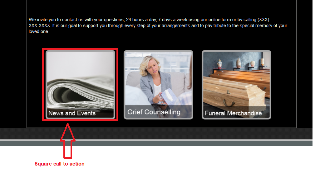
While rectangular call to actions have the placeholder name rectangle-call-to-action.
These are the most popular types of placeholders on any skin so there will almost always be more than 1. When naming them, you should use the same pattern set out by the general-placeholder list above.
- call-to-action
- call-to-action2
- call-to-action3
Same with the rectangle call to actions.
- rectangle-call-to-action
- rectangle-call-to-action2
- rectangle-call-to-action3
Placeholder Style rules
All placeholders should have a width, but their height definition may vary. For all placeholders that show up in the main content area, they already have a minn-height set for editing ONLY. NEVER EVER set a min-height for these in your main skin.css file. These placeholders need to collapse to nothing if they have no content.
As for the call to action placeholders and the general placeholders, you will ONLY assign a static height if one of the following is true.
- The placeholder is positioned absolutely and if it's height expands downwards it will overlap other content.
- If the placeholder height expands downward, it will push elements down causing background images or banner images to no longer fit in the alotted space.
If you do not assign a static height, then you can assign a min-height. Generally min-height is best for the following situations.
- The placeholder's height can expand downward and push other content down without the website looking odd.
- The placeholder is a text placeholder and we need to setup a min-height so there is room to type if the placeholder is empty.
- Placeholder has nothing below it.
If you are unsure whether to use a static heigh or a min-height, go with a min-height and test large content and see how it looks.
As for reserved placeholders, with the exception of the tribute list, they all have static heights.